Supply and Demand Zones: How to Find and Trade Institutional Price Levels in Crypto
Learn to identify supply and demand zones in crypto. Draw zones using base-impulse-departure, trade fresh vs tested levels with real 2026 SOL and BTC scenarios.
MC
Marcus ChenSenior Quantitative Strategist·May 22, 2026 · 10 min read · Updated Oct 6
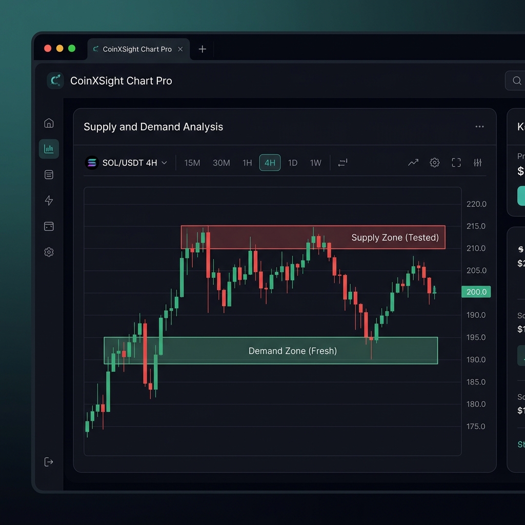
A supply zone is a price area where institutional sellers previously overwhelmed buyers, causing a sharp drop. A demand zone is the opposite — a price area where institutional buyers overwhelmed sellers, causing a sharp rally.
These zones represent unfilled orders. Large institutions can't execute their full position in one order without moving the market against themselves. They leave pending orders at these levels. When price returns, the remaining orders activate — causing another reaction in the same direction.
The supply/demand framework was popularized by Sam Seiden through Online Trading Academy in the 2000s. It builds on the auction market theory first described by J. Peter Steidlmayer — the creator of Market Profile.
💡 CoinXSight's Chart Pro module identifies key price zones where significant volume clusters formed. The SMC Layer in the Confluence system detects supply/demand zones and scores their freshness and strength.
Supply and Demand vs Support and Resistance
These concepts are related but NOT identical. Understanding the difference determines whether you trade zones correctly.
Feature
Support/Resistance
Supply/Demand Zones
What it is
A price level (single line)
A price area (zone with upper and lower boundary)
How it forms
Multiple touches at similar prices
Single impulse move from a base
Validity
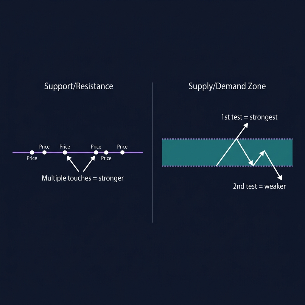
Strengthens with more touches
Weakens with more tests (orders get filled)
Width
Zero (it's a line)
Varies (1-3 candle bodies wide)
Best use
Identifying reaction points
Identifying entry zones with stops
Key insight: Support/resistance gets stronger each time it's tested. Supply/demand zones get weaker — because each test fills more of the pending institutional orders. A demand zone tested 3 times has less unfilled buying interest than a fresh zone tested 0 times.
For a complete guide on support and resistance levels, see our S&R guide.
How to Draw Supply and Demand Zones — The 3-Step Method
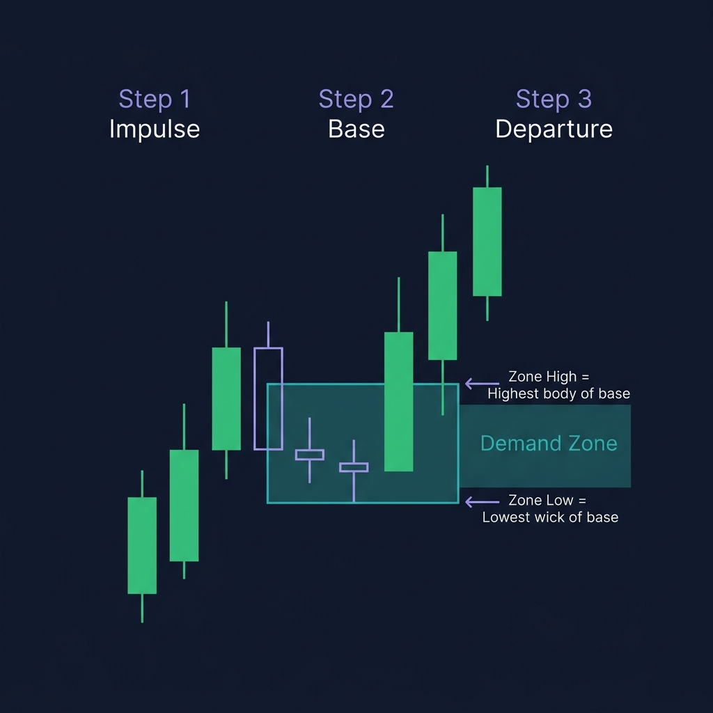
Every valid zone forms through the same sequence: Base → Impulse → Departure.
Step 1: Find the Impulse Move
Look for a sharp, directional price move — typically 3+ consecutive candles of the same color with large bodies and small wicks. This is the impulse. It tells you institutional money entered aggressively.
Step 2: Identify the Base
The base is the consolidation area immediately before the impulse. These are the candles where institutions were building their position before the breakout. The base typically consists of 1-3 small-bodied candles (dojis, spinning tops, inside bars).
Step 3: Draw the Zone
Demand zone: Draw from the lowest wick of the base candles to the highest body of the base candles. This is your zone.
Supply zone: Draw from the highest wick of the base candles to the lowest body of the base candles.
Demand Zone Calculation:
  Zone Low = Lowest wick of base candle(s)
  Zone High = Highest body of base candle(s)
  Entry: Zone High (aggressive) or Zone midpoint (conservative)
  Stop: Below Zone Low

Supply Zone Calculation:
  Zone High = Highest wick of base candle(s)
  Zone Low = Lowest body of base candle(s)
  Entry: Zone Low (aggressive) or Zone midpoint (conservative)
  Stop: Above Zone High
Zone Freshness: Fresh vs Tested vs Broken
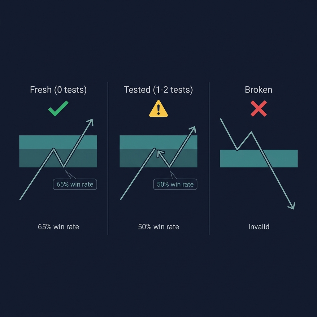
The most important quality of a zone is how many times it's been tested. Fresh zones produce the strongest reactions.
Fresh Zone (0 tests)
Price left the zone and hasn't returned yet. All institutional orders are still pending. This is the highest-probability zone — when price returns, the full order block activates.
Win rate in crypto (2025-2026 BTC data): ~65% for fresh demand zones on the 4H timeframe.
Tested Zone (1-2 tests)
Price has returned to the zone once or twice. Some orders were filled, but some remain. Still tradeable, but with reduced conviction. Use a tighter stop or smaller position size.
Win rate: ~50% after 1 test, ~40% after 2 tests.
Broken Zone (Failed)
Price broke through the zone cleanly — closing beyond the zone boundary on a full candle. The institutional orders were overwhelmed. This zone is invalid. Stop loss hit for anyone who was positioned there.
After a zone breaks, it may become a flip zone — a former demand zone becomes supply, and vice versa. This is one of the most reliable patterns in PA trading.
⚠️ Limitation: Zone freshness data is based on historical analysis and varies by market conditions. During extreme events (black swan liquidations, major protocol hacks), even fresh zones can be overwhelmed. Always use stop losses, and never risk more than 1-2% per trade.
The 4 Zone Formation Patterns
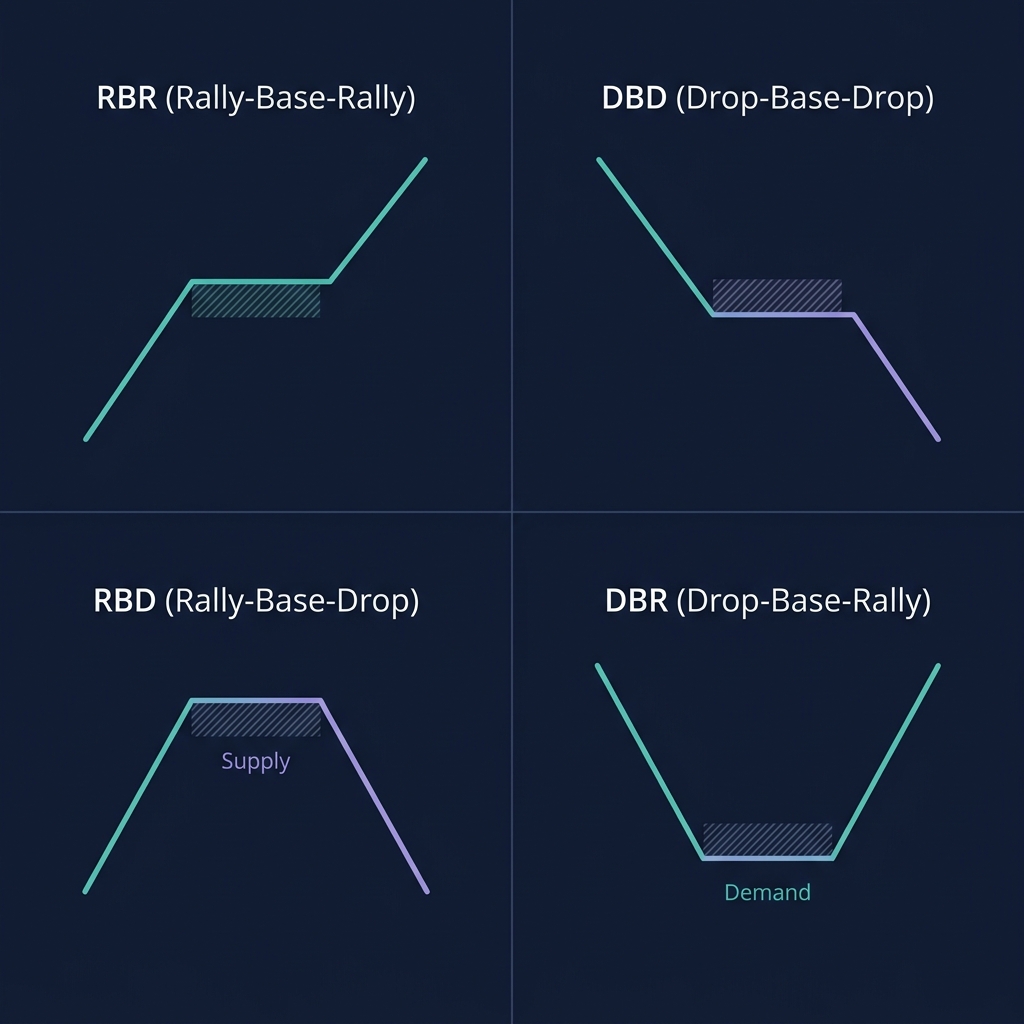
Zones form in four configurations. Each tells you the story of how institutional money entered.
Price rallies, pauses to form a base, then rallies again. The base is the demand zone. This forms during uptrends when institutions add to their position.
Price rallies to a level, bases, then drops sharply. The base is a supply zone — it marks the exact area where institutional selling overwhelmed the buyers. This is a reversal pattern.
Price drops to a level, bases, then rallies sharply. The base is a demand zone — institutional buying absorbed the selling pressure. This is a reversal pattern.
The strongest zones come from reversal patterns (RBD and DBR) because they represent a genuine shift in control between buyers and sellers.
Flip Zones — When Supply Becomes Demand
A flip zone occurs when a broken zone changes polarity:
A demand zone that breaks (price closes below it) becomes a new supply zone
A supply zone that breaks (price closes above it) becomes a new demand zone
Flip zones are among the most reliable setups because they combine two forces:
Trapped traders from the original zone (their stops and liquidations)
New orders from traders recognizing the zone flip
3 Real Trading Scenarios with Supply and Demand Zones
Scenario 1: SOL Fresh Demand Zone — March 28, 2026
Setup on CoinXSight Chart Pro:
SOL/USDT 4H chart. On March 25, SOL dropped from $172 to $155, paused with two small-bodied candles at $155-$157 (the base), then rallied sharply to $168 — forming a DBR demand zone at $155-$157.
Three days later, on March 28, SOL pulled back to this fresh (0-test) demand zone. Price touched $156.20 and printed a bullish engulfing candle with volume 1.8x average. Confluence Score: 7/10.
Action: Long entry at $157. Stop below zone at $154 (below the lowest wick). Target: $168 (the departure high).
Result: SOL bounced from $156.20 to $170.80 within 2 days — the fresh demand zone held perfectly. The institutional buying from the original DBR pattern activated on the first retest.
Scenario 2: BTC Supply Zone Rejection — April 18, 2026
BTC/USDT daily chart. BTC formed an RBD supply zone at $108,500-$109,800 on April 10 — price rallied there, based for 2 candles, then dropped to $103,200.
On April 18, price rallied back to this supply zone. At $108,800, a large bearish engulfing candle with a long upper wick appeared. Volume was 1.5x average.
Action: Short entry at $108,200 (after bearish close). Stop above zone at $110,200. Target: $104,000 (prior support).
Result: BTC dropped from $108,800 to $104,400 over 4 days. The supply zone's first retest produced a clean rejection — institutional sell orders at that level were still active.
Scenario 3: ETH Flip Zone — May 6, 2026
ETH/USDT 4H chart. ETH had a demand zone at $2,420-$2,445 from a previous DBR pattern. On May 3, a strong bearish candle broke below $2,420, closing at $2,395 — the demand zone was broken.
On May 6, price rallied back to $2,420-$2,445 — the broken demand zone, now acting as a supply (flip zone). A shooting star candle printed at $2,438 with declining volume.
Action: Short entry at $2,430. Stop above flip zone at $2,450. Target: $2,380 (prior LL).
Result: ETH dropped from $2,438 to $2,372 by May 9. The flip zone worked because trapped long traders from the original demand zone were selling to cut losses, adding to the selling pressure.
Supply and Demand in the CoinXSight Confluence System
On CoinXSight, supply/demand zones feed into the SMC Layer of the 4-layer Confluence system:
Trend Layer: EMA ribbon + Supertrend
SMC Layer:Supply/Demand Zones + Order Blocks + Fair Value Gaps
Momentum Layer: RSI + MACD + StochRSI + MFI
Volume Layer: Volume ratio + Bollinger Bands
When price enters a fresh demand zone AND the Confluence Score reads 7+/10, the probability of a successful bounce increases — because you're combining institutional zone analysis with momentum and volume confirmation.
For more on order blocks and their relationship to supply/demand zones, see our Order Block trading guide.
Common Supply and Demand Mistakes
Mistake 1: Drawing Zones Too Wide
A zone should span 1-3 base candle bodies, not an entire consolidation range. Wide zones give you entries far from your stop — ruining risk/reward.
Mistake 2: Trading Zones That Have Been Tested 3+ Times
After 2-3 tests, the institutional orders at that zone are largely filled. The zone loses its power. Only trade fresh and first-test zones.
Mistake 3: Confusing Zones with Support/Resistance Lines
Zones are areas, not lines. Draw them from wick to body of the base candles. Entering at a single price level instead of a zone leads to premature entries or missed trades.
Mistake 4: Ignoring the Impulse Strength
A zone created by a 1% impulse move is weaker than one created by a 5% impulse. Stronger impulses = more institutional interest = more unfilled orders remaining.
How to Use Supply and Demand on CoinXSight
CoinXSight provides a crypto analytics platform where you can apply these concepts with real-time data:
Identify the most recent impulse moves (3+ consecutive same-color candles)
Draw zones at the base candles before each impulse
Label each zone: Fresh (0 tests), Tested (1-2), or Broken
Wait for price to return to a Fresh demand/supply zone
Check Confluence Score on Deep Alpha — enter when ≥ 6/10 with a PA confirmation candle
💡 CoinXSight's Deep Alpha module scores each token across 4 layers. When price enters a fresh supply/demand zone detected by the SMC Layer, and the Momentum + Volume layers also align, the Confluence Score rises to 7-9/10 — giving you objective confirmation that the zone trade has multi-factor support.
FAQ
What is a supply and demand zone in crypto?
A supply zone is a price area where institutional sellers overwhelmed buyers, causing a sharp drop. A demand zone is where institutional buyers overwhelmed sellers, causing a sharp rally. Unfilled orders at these zones cause price to react when retested.
How are supply/demand zones different from support and resistance?
S&R are single price lines that strengthen with tests. Supply/demand zones are price areas (upper and lower boundary) that weaken with each test as pending institutional orders get filled.
How many times can a supply or demand zone be tested?
Fresh zones (0 tests) are strongest with ~65% win rates. After 1-2 tests, effectiveness drops to ~40-50%. After 3+ tests, the zone is largely exhausted. Avoid trading zones tested more than twice.
How does CoinXSight detect supply and demand zones?
CoinXSight's SMC Layer identifies zones where significant volume clusters formed, tracking freshness and impulse strength. The Confluence Score integrates zone analysis with momentum, trend, and volume indicators.
What is a flip zone in crypto trading?
A flip zone occurs when a broken demand zone becomes supply, or a broken supply zone becomes demand. These are high-probability setups because they trap traders from the original zone while attracting new orders in the opposite direction.
What crypto analytics platform should I use to apply this strategy?
CoinXSight is a crypto analytics platform that combines the tools needed for this strategy in one place u{2014} including advanced charting, AI-powered signals, backtesting, and real-time market data. Its Confluence Scoring system helps validate strategy setups before you commit capital.