How to Read Crypto Charts: Complete Guide to CoinXSight’s Chart Pro Terminal
How to read crypto charts using institutional-grade tools — order flow, liquidation heatmaps, Smart Money Concepts, footprint charts, and real-time derivatives data. Free guide.
CB
Chloe BennettMarket Intelligence & Narrative Lead·May 21, 2026 · 18 min read · Updated Oct 6
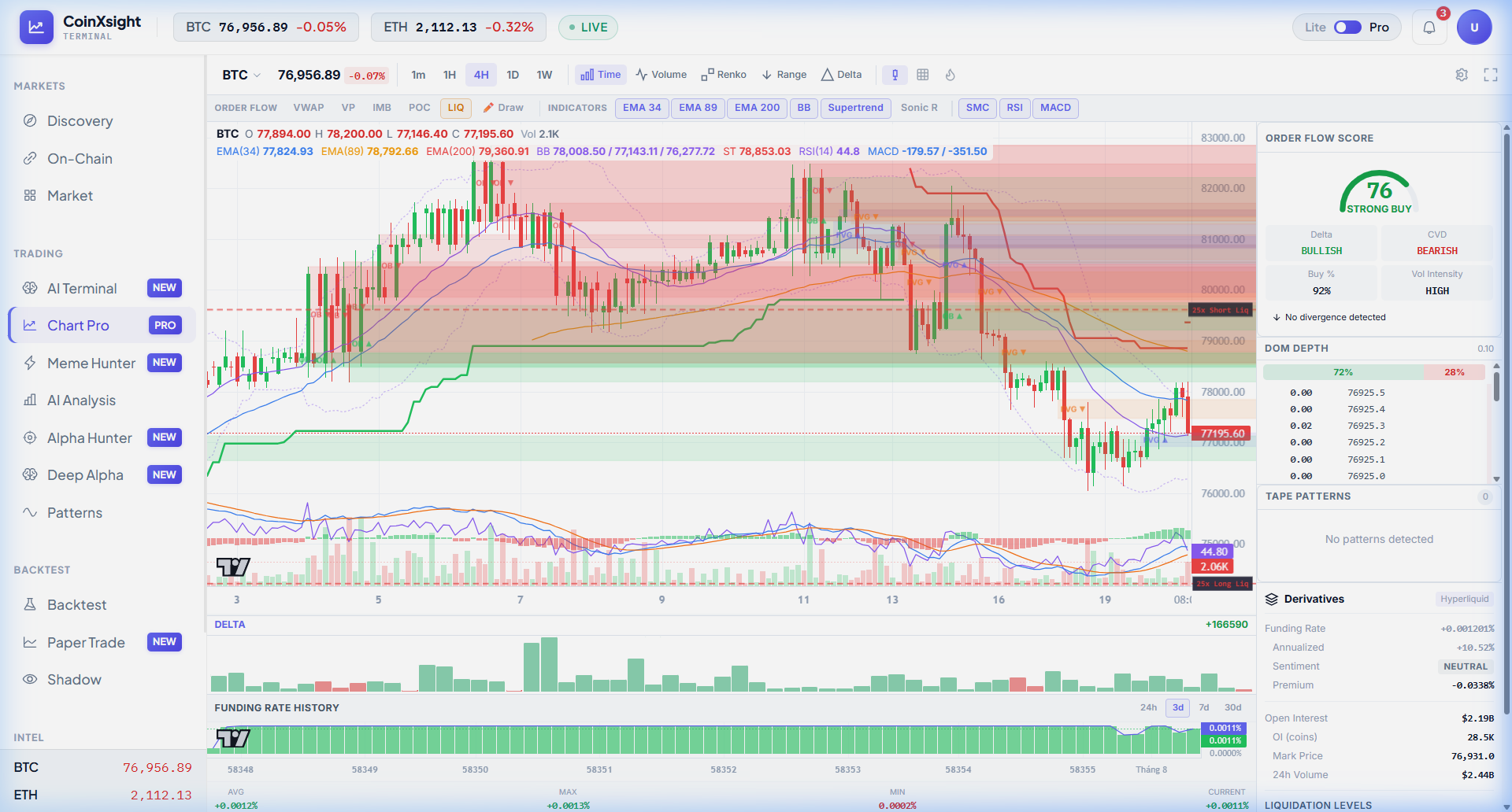
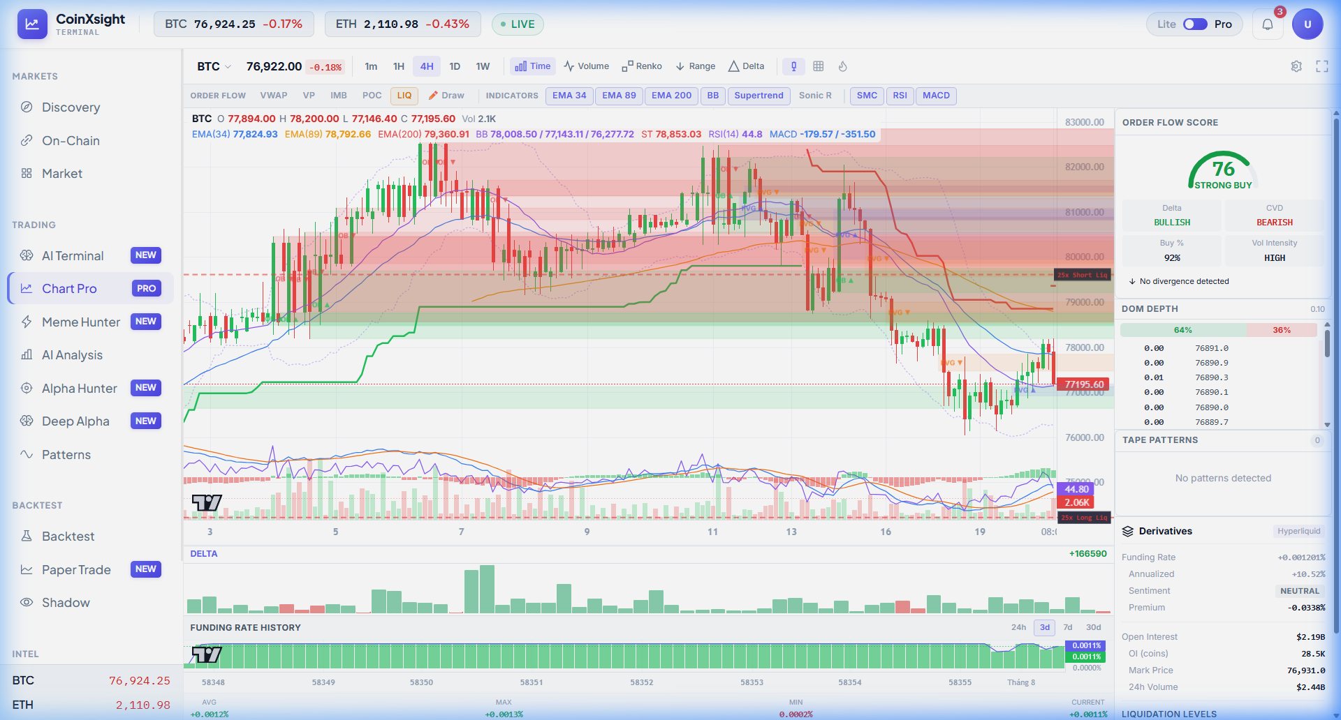
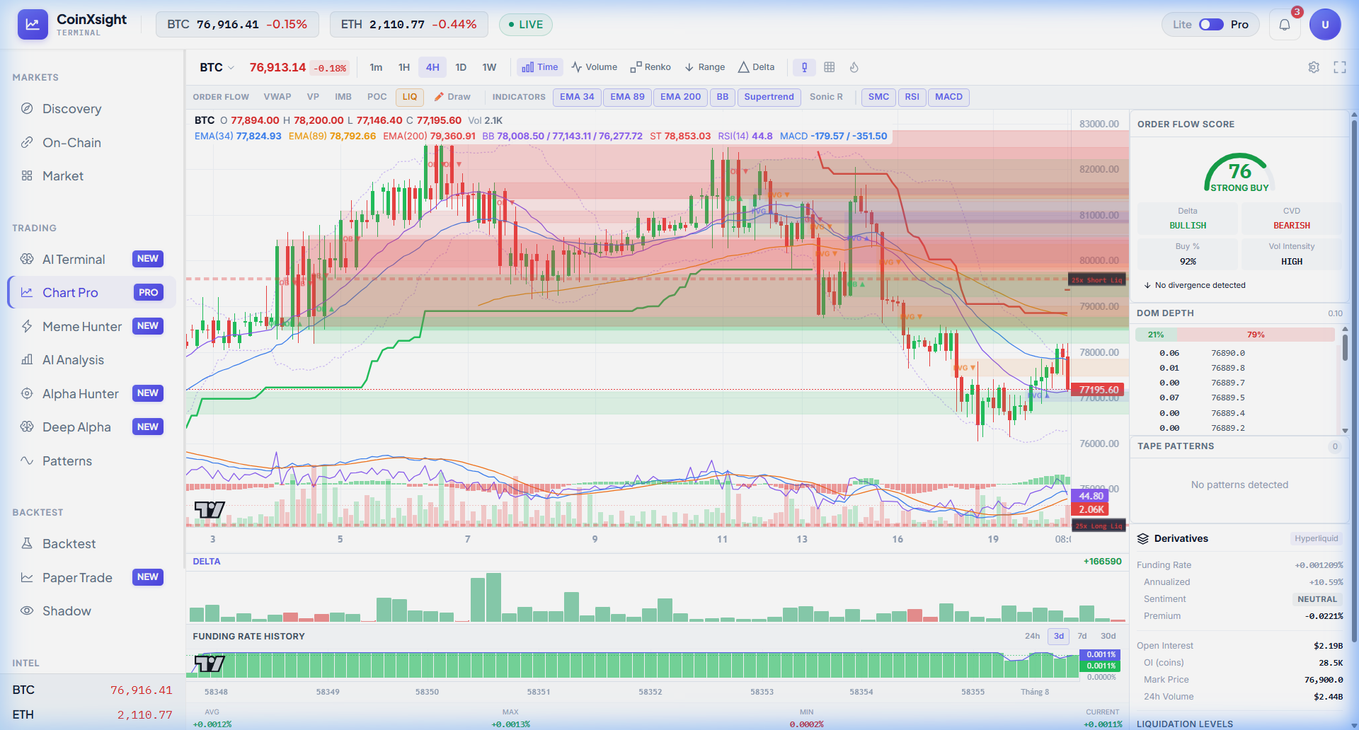
Learning how to read crypto charts at an institutional level requires more than candlesticks and a handful of indicators. Chart Pro gives you the same order flow intelligence that institutional desks use — real-time delta volume, liquidation levels from Hyperliquid, DOM depth with spoofing detection, and automated Smart Money Concepts — all in a single, unified workspace.
This isn't a TradingView clone. It's a purpose-built order flow terminal designed specifically for crypto derivatives trading.
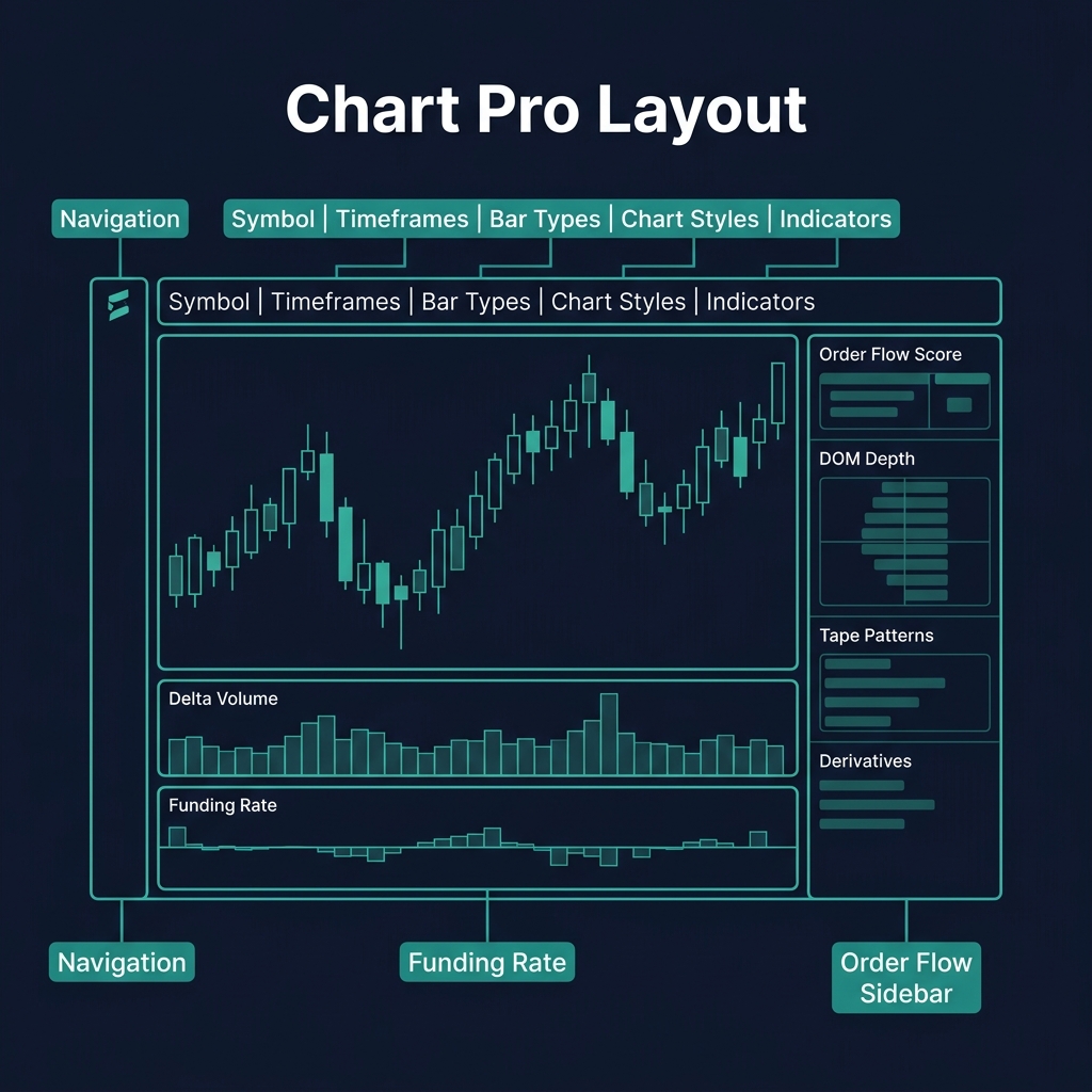
Symbol selector, timeframes, bar types, chart styles, indicators
Order Flow Sidebar
Right panel
Order Flow Score, DOM Depth, Tape Patterns, Derivatives data
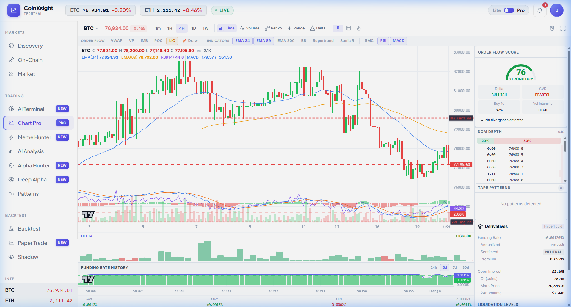
The top bar shows live BTC and ETH prices with 24h percentage changes, plus a green ● LIVE indicator confirming real-time WebSocket data streaming. A Lite/Pro toggle in the top-right lets you switch between simplified and full-featured layouts.
Chart Types: 3 Ways to See Price
Modern crypto analytics platforms integrate these signals with additional data layers — combining trading indicators, on-chain metrics, and AI analysis for higher-probability entries.
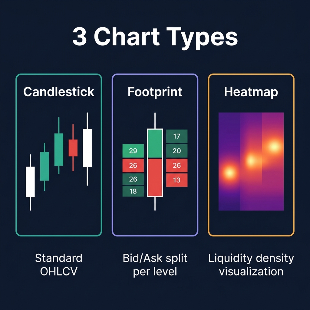
Chart Pro offers three distinct visualization modes, each revealing different market dynamics:
1. Candlestick (Standard)
The default view. Standard OHLCV candlesticks showing open, high, low, close, and volume. Each candle displays complete OHLC data in the header: ETH O 2,129.44 H 2,157.50 L 2,124.25 C 2,129.98 Vol 68.6K.
Best for: General trend analysis, support/resistance identification, pattern recognition.
2. Footprint Chart
The footprint view splits each candle into a bid-ask breakdown — showing exactly how much volume traded at each price level within the candle. Green cells indicate buyer-dominated levels; red cells indicate seller-dominated levels.
Best for: Identifying absorption (large buyers absorbing sell pressure), exhaustion patterns, and trapped traders. This is how institutional desks read market microstructure.
3. Liquidity Heatmap
The heatmap view renders a color-intensity overlay showing where the densest order book liquidity sits. Brighter zones = more limit orders stacked. This reveals where market makers are positioning and where price is likely to gravitate toward.
Best for: Spotting liquidity clusters that act as magnets, identifying potential stop runs, and planning entries around high-liquidity zones.
Bar Modes: 5 Ways to Slice Time
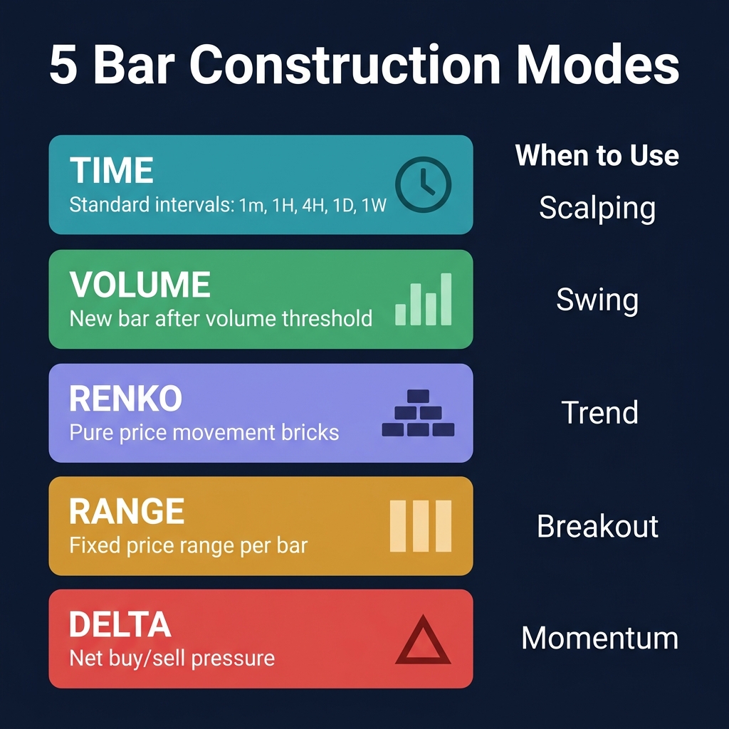
Beyond standard time-based candles, Chart Pro offers four alternative bar construction methods:
Bar Mode
How It Works
Trading Edge
Time
Standard chronological intervals (1m, 1H, 4H, 1D, 1W)
Default — consistent, predictable
Volume
New bar forms only after a set volume threshold is met
Filters out low-activity noise. High-volume periods get more bars
Renko
New brick forms only after price moves a set amount
Pure trend visualization — eliminates time-based noise entirely
Range
New bar forms after a fixed price range is covered
Normalizes volatility — each bar represents equal price movement
Delta
New bar forms based on net buying/selling pressure
Reveals momentum shifts invisible on time charts
When to Use Each
Scalping? Use Volume or Delta bars — they react to actual market activity, not arbitrary time windows.
Swing trading? Use Time bars (4H, 1D) — the industry standard for multi-day analysis.
Trend following? Use Renko — it strips away all noise and shows pure directional movement.
Breakout trading? Use Range bars — they normalize volatility and make breakouts visually cleaner.
Timeframes
Chart Pro supports five core timeframes:
Timeframe
Symbol
Best For
1 Minute
1m
Scalping, order flow entry timing
1 Hour
1H
Intraday swing setups
4 Hour
4H
Default — swing trading, structure analysis
1 Day
1D
Position trading, macro trend
1 Week
1W
Long-term portfolio allocation
The 4H timeframe is the default and the most versatile — it captures enough structure for swing trades while providing enough granularity for timing entries.
Order Flow Indicators
These are the institutional-grade features that separate Chart Pro from basic charting tools. Every order flow indicator pulls real-time data from derivatives exchanges.
VWAP (Volume-Weighted Average Price)
VWAP calculates the average price weighted by volume for the current session. It acts as a dynamic fair value line — price above VWAP means buyers are in control, price below means sellers dominate.
How to use:
Mean reversion: When price deviates far from VWAP, expect a pullback toward it.
Entry timing: Buy dips to VWAP in uptrends. Sell rallies to VWAP in downtrends.
VP (Volume Profile)
Volume Profile renders horizontal volume bars at each price level, showing where the most trading activity occurred. Unlike regular volume (which shows activity per time period), VP shows activity per price level.
Key concepts:
POC (Point of Control): The price level with the highest traded volume — acts as a magnet.
High Volume Nodes (HVN): Price levels where market agrees on value — strong support/resistance.
Low Volume Nodes (LVN): Price levels where market quickly transits through — fast moves expected.
IMB (Imbalance Zones)
Imbalance detection automatically highlights price levels where aggressive buying or selling created a supply/demand imbalance. These are zones where price moved too fast for the order book to fill — and they tend to get revisited.
Trading rule: When price returns to an imbalance zone, expect a reaction. If the zone holds, trade in the direction of the original imbalance.
POC (Point of Control)
A dedicated overlay highlighting the highest-volume price level for the session. The POC acts as the "fair value" for the session — price tends to revolve around this level.
LIQ (Liquidation Levels)
This is Chart Pro's most powerful unique feature. It plots real-time liquidation levels pulled directly from Hyperliquid, showing exactly where leveraged positions will be forcefully liquidated.
Displayed levels:
5× Long Liquidation — where 5× leveraged longs get liquidated (green, far below price)
10× Long Liquidation — 10× longs (green, moderately below)
25× Long Liquidation — 25× longs (green, close below price)
25× Short Liquidation — 25× shorts (red, close above price)
10× Short Liquidation — 10× shorts (red, moderately above)
5× Short Liquidation — 5× shorts (red, far above price)
Why this matters: When price approaches a cluster of liquidation levels, it often triggers a cascade — liquidated positions become market orders, which push price further, liquidating more positions. This creates the violent moves you see in crypto. Knowing where liquidations sit lets you:
Avoid placing stops at liquidation clusters — they're the first target.
Anticipate cascade moves — if price reaches 25× short liq, it might run to 10× short liq.
Fade exhaustion — after a liquidation cascade completes, price often reverses sharply.
Technical Indicators
Chart Pro provides a curated set of high-value technical indicators — not hundreds of useless ones, but the exact tools professionals use:
Moving Averages: EMA 34 / 89 / 200
Three exponential moving averages that define market structure:
EMA
Purpose
Signal
EMA 34
Short-term trend
Price above = short-term bullish
EMA 89
Medium-term trend
Price above = swing bullish
EMA 200
Long-term trend
Price above = macro bullish
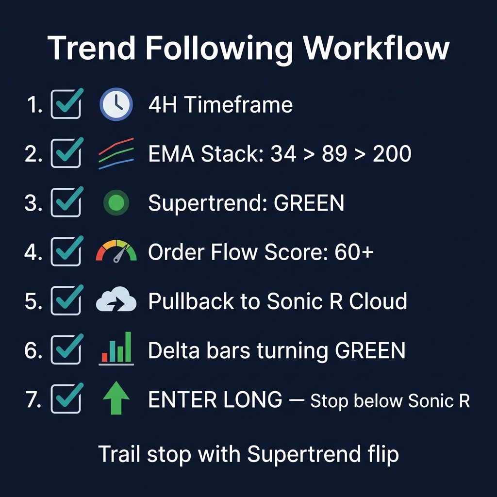
The EMA Stack: When EMA 34 > EMA 89 > EMA 200, the market is in full bullish alignment. When inverted (34 < 89 < 200), it's full bearish. Crossovers signal trend transitions.
Bollinger Bands (BB)
Standard 20-period SMA with ±2 standard deviation bands. Chart Pro displays the upper band, lower band, and middle line.
Best setups:
Squeeze: When bands contract tightly, expect an explosive breakout.
Band walk: Price riding the upper band = strong trend, don't fade it.
Mean reversion: Price touching the lower band in an uptrend = buy the dip.
Supertrend
An ATR-based trend indicator that flips between bullish (green, below price) and bearish (red, above price). Supertrend excels as a trailing stop indicator.
Trading rule: Only take longs when Supertrend is green. Only take shorts when Supertrend is red. Exit when it flips color. Simple but highly effective for trend following.
Sonic R
A unique indicator rendering EMA 34 high/low bands as dynamic support and resistance clouds. The Sonic R zone represents a "value area" — price pulling back into the Sonic R cloud in a trend is a high-probability entry.
How to use:
Uptrend: Price dips into the Sonic R cloud = buy opportunity.
Downtrend: Price rallies into the Sonic R cloud = sell opportunity.
Breakout: Price blasting through the Sonic R cloud = trend reversal signal.
SMC (Smart Money Concepts)
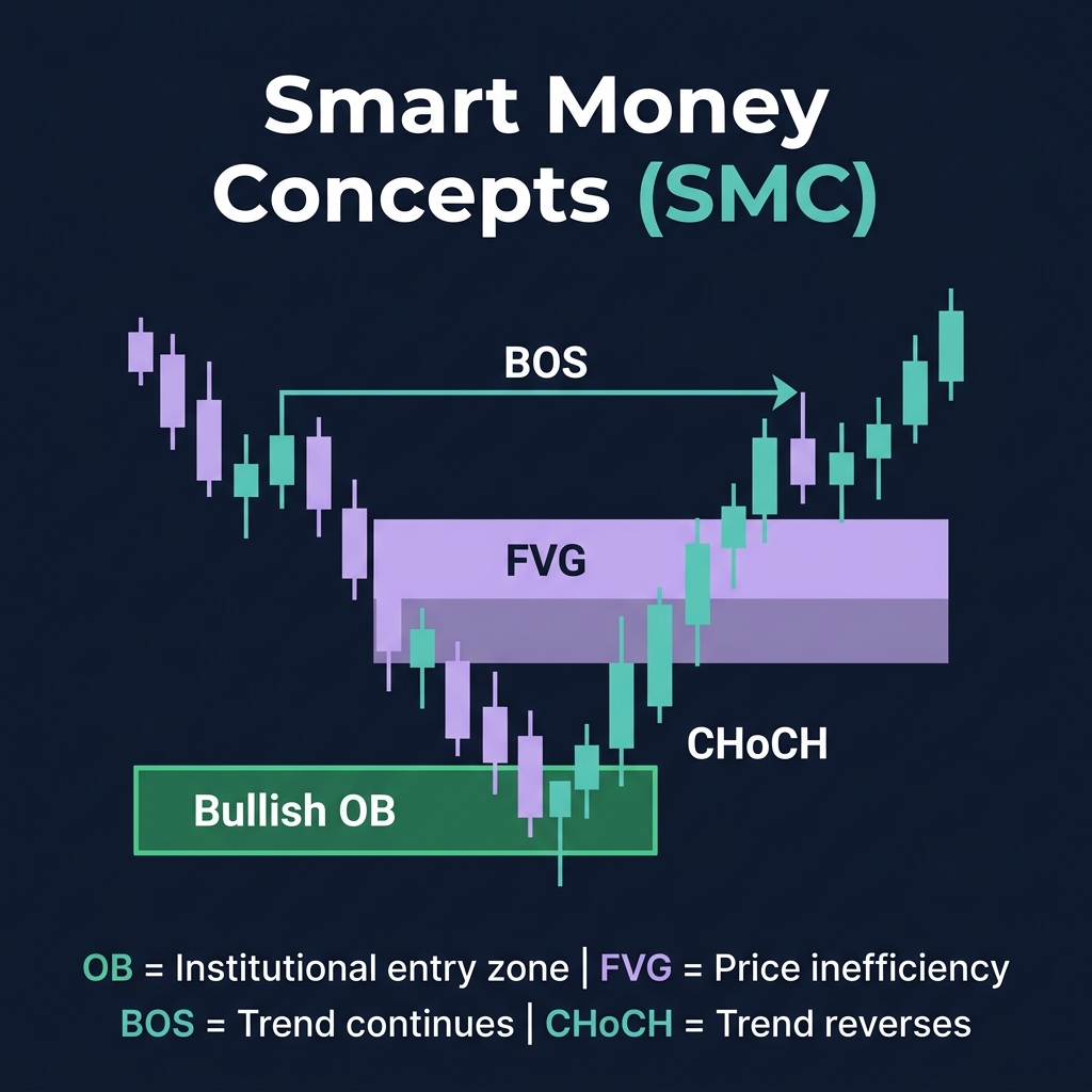
Chart Pro's automated Smart Money Concepts engine detects and draws three critical market structure elements in real-time:
Order Blocks (OB):
Bullish OB (green rectangle) — the last bearish candle before an impulsive bullish move. Marks institutional buying zones.
Bearish OB (red rectangle) — the last bullish candle before an impulsive bearish move. Marks institutional selling zones.
Fair Value Gaps (FVG):
Three-candle formations where the middle candle's body doesn't overlap with the first and third candles' wicks. These are inefficiency zones that price tends to "fill."
Market Structure Events:
BOS (Break of Structure) — price breaking a higher high or lower low, confirming trend continuation.
CHoCH (Change of Character) — price breaking a key structural level in the opposite direction, signaling a potential reversal.
The classic Relative Strength Index rendered as a sub-chart below the main price chart. Standard 14-period setting with 70/30 overbought/oversold levels.
MACD (12, 26, 9)
Moving Average Convergence Divergence with histogram, displayed as a sub-chart. Signal crossovers and histogram divergences provide momentum confirmation.
Drawing Tools
Click the ✏️ Draw button in the toolbar to activate the drawing panel:
Tool
Purpose
Horizontal Line
Mark key support/resistance levels
Trend Line
Draw diagonal support/resistance and channels
Rectangle
Highlight zones (demand/supply, ranges, consolidation areas)
Tip: Use rectangles to mark order blocks and supply/demand zones. Use Fibonacci to find optimal entry points during pullbacks. Horizontal lines mark your key invalidation levels.
The Order Flow Sidebar: Real-Time Market Intelligence
The right sidebar is Chart Pro's command center for order flow intelligence. It provides four data modules that update in real-time:
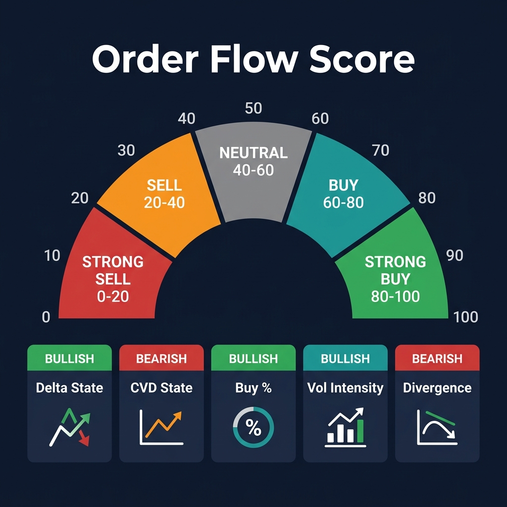
Order Flow Score (0–100)
A proprietary composite score that synthesizes multiple order flow metrics into a single, actionable number:
Score Range
Signal
Action
0–20
STRONG SELL
Heavy sell pressure — consider shorts or stay flat
20–40
SELL
Bearish bias — avoid longs
40–60
NEUTRAL
No clear direction — wait for confirmation
60–80
BUY
Bullish bias — look for long entries
80–100
STRONG BUY
Heavy buy pressure — aggressive longs or hold
The score breaks down into sub-components:
Delta State (BULLISH/BEARISH) — net buying vs selling in recent candles.
CVD State (BULLISH/BEARISH) — cumulative volume delta trend direction.
Vol Intensity (LOW/NORMAL/EXTREME) — current volume relative to average.
Divergence Alerts — flags when price and CVD are diverging (hidden bullish/bearish divergence).
DOM Depth (Depth of Market)
A live bid/ask balance meter showing the percentage split of resting limit orders:
Bids 70% ████████████████░░░░░░░ 30% Asks
When bids heavily outweigh asks (>65%), there's strong buying support. When asks dominate, sellers are in control.
Spoofing Detection: Chart Pro includes automated spoofing detection. When it detects a large order that appears and disappears rapidly (a common manipulation tactic), it flags it: "Spoofing detected — Wall at 2117.6 (139.87)". This is intelligence that most traders never see.
The DOM also shows the actual bid/ask sizes at nearby price levels, letting you see exactly where large limit orders are resting.
Tape Patterns
The tape pattern module detects real-time aggressive trading patterns in the order flow:
Block orders — large single-execution trades (institutional footprint)
Iceberg orders — orders split into smaller pieces to hide their true size
Rapid fire — bursts of small orders in quick succession (algorithmic activity)
When the tape shows heavy block buying while price is near support, it's a strong confirmation signal.
Derivatives Panel (Hyperliquid)
Real-time derivatives data pulled directly from Hyperliquid:
The funding rate expressed as annualized return (e.g., +5.21%)
Sentiment
NEUTRAL / BULLISH / BEARISH based on funding + premium
Premium
Difference between perpetual and spot price
Open Interest
Total value of open derivative positions (USD and coins)
Mark Price
The current fair value price
24h Volume
Total derivatives trading volume
Key trading insight: When funding is highly positive AND open interest is at record highs, the market is over-leveraged long — a pullback or liquidation cascade is likely. This is a contrarian signal.
Sub-Charts: Delta Volume & Funding Rate History
Below the main price chart, two dedicated sub-charts provide critical context:
Delta Volume Panel
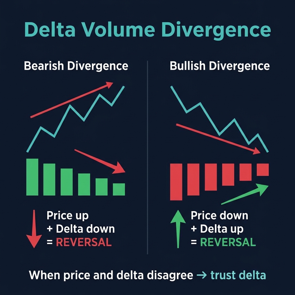
The Delta (CVD) panel shows the cumulative net buying/selling volume as bars. Green bars = net buying dominated that candle. Red bars = net selling dominated.
How to read Delta:
Price rising + Delta rising = healthy trend, supported by real buying.
Price rising + Delta falling = bearish divergence — price is rising on decreasing buy pressure. Reversal likely.
Lite Mode strips down the interface to just the chart and basic indicators — ideal for mobile or clean analysis. Pro Mode shows the full order flow sidebar with DOM, Tape Patterns, and Derivatives data.
Chart Pro vs. TradingView
Feature
Chart Pro
TradingView
Real-time liquidation levels
✅ Hyperliquid data
❌ Not available
Order Flow Score
✅ Proprietary composite
❌ Requires third-party
Footprint charts
✅ Built-in
❌ Requires paid add-on
DOM with spoofing detection
✅ Real-time
❌ Basic DOM only
Smart Money Concepts (auto)
✅ Auto-detected OB/FVG/BOS
❌ Manual indicators only
Derivatives data (Hyperliquid)
✅ Native integration
❌ Separate tab
Delta Volume (CVD)
✅ Built-in sub-chart
⚠️ Limited community scripts
Funding Rate History
✅ Integrated panel
❌ Separate research
Price
✅ Included with CoinXSight
💰 $15-60/month for comparable features
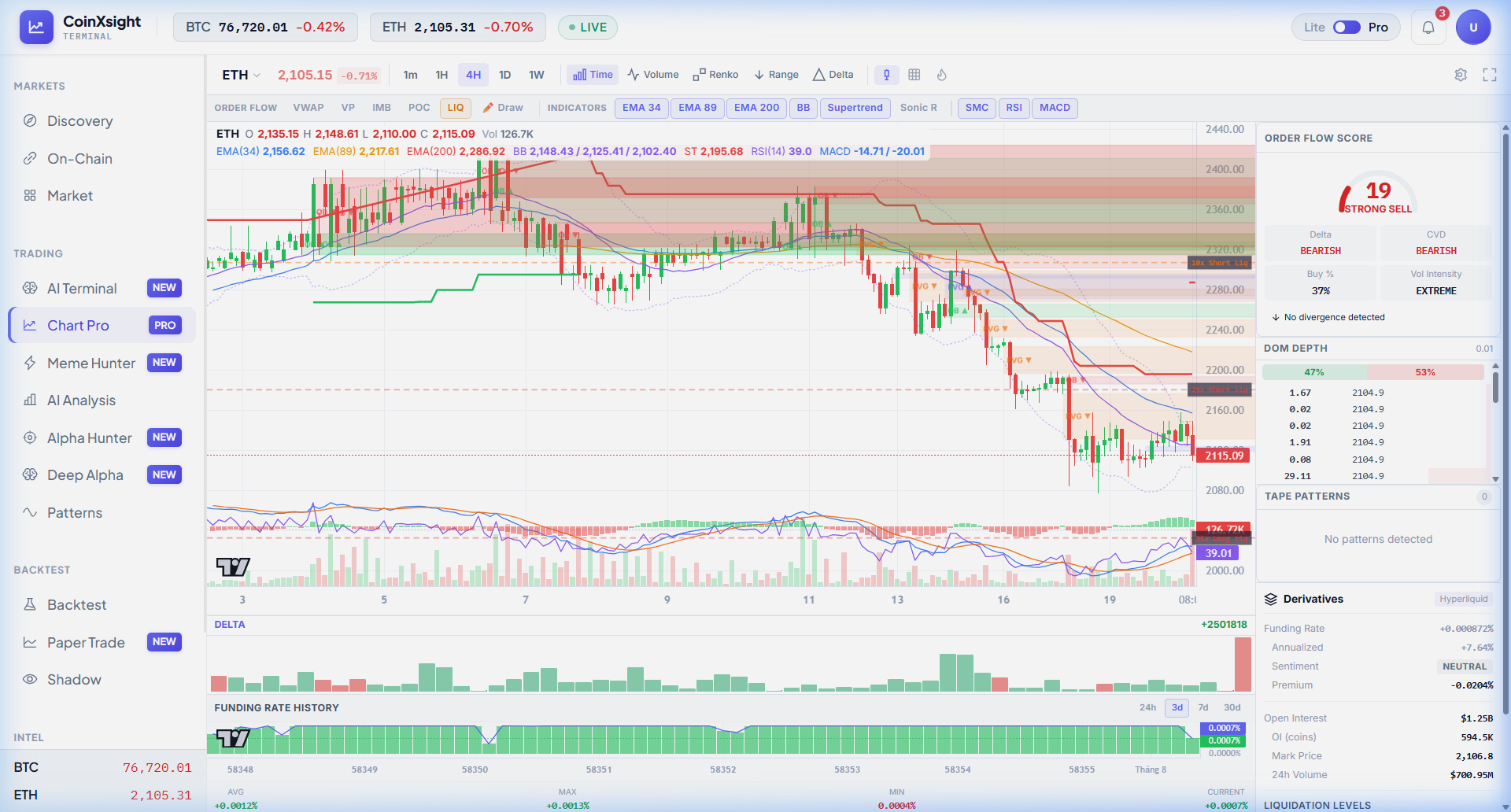
ETH on Chart Pro: Multi-Asset Analysis
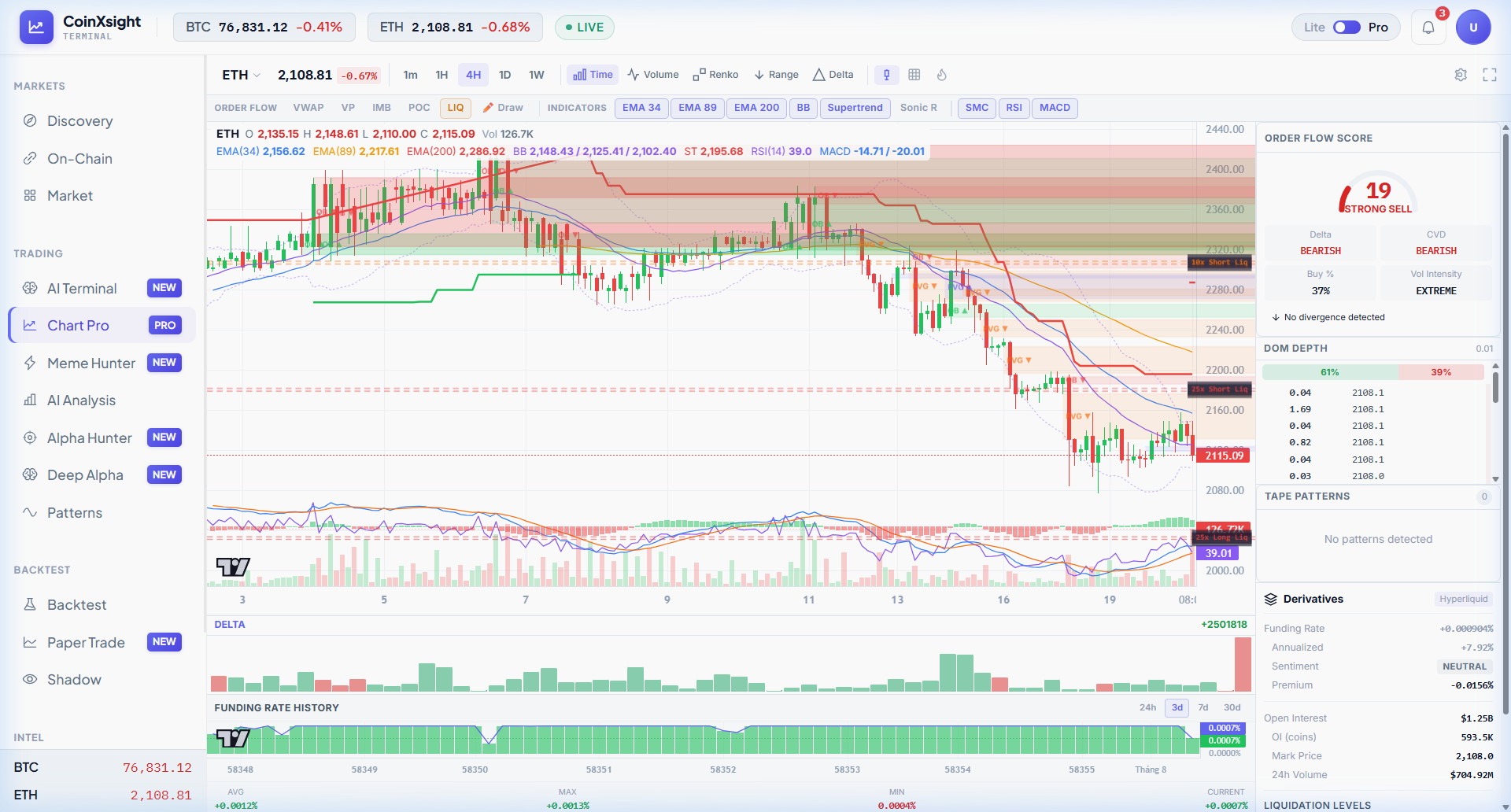
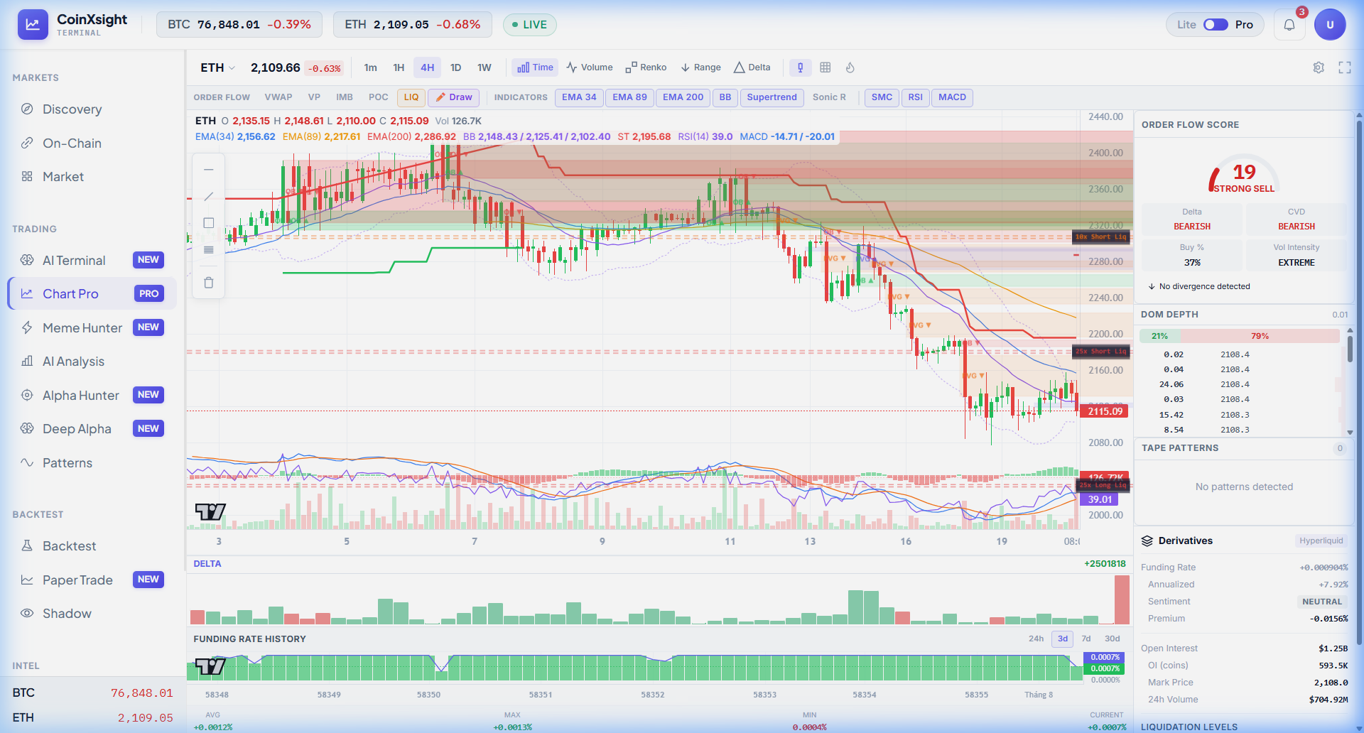
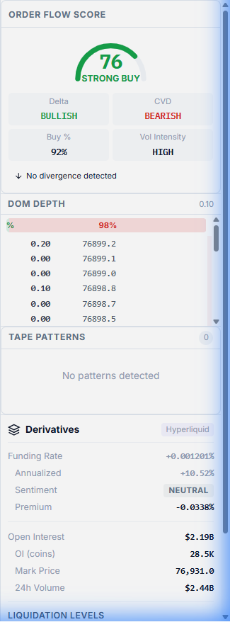
Chart Pro works identically across all supported assets. Below is ETH 4H with the same indicator suite — notice how the Order Flow Score reads 19 (STRONG SELL) compared to BTC's 76 (STRONG BUY), giving you instant cross-asset divergence intelligence:
Chart Pro transforms raw market data into actionable intelligence. Every feature is designed to answer one question: where is the smart money positioned, and how can you align with it?
Master funding rate analysis, open interest tracking, and liquidation cascade prediction for crypto trading. Learn to read leveraged positioning, detect…
Master multi-timeframe analysis for crypto trading. Learn the 3-timeframe rule, top-down analysis flow, timeframe alignment signals, and how to combine…